12 vintage aesthetic stickers

I absolutely adore bringing a touch of the past into my creative projects, and vintage aesthetic stickers are one of my favorite ways to do it. There’s something so charming about the aged textures, classic motifs, and nostalgic color palettes that these stickers offer. Whether I’m decorating my journal, personalizing a gift, or adding a unique flair to a DIY craft project, they always seem to add that perfect layer of character and story.
I’ve found that even a small sticker can transform an ordinary item into something truly special. They’re incredibly versatile, allowing for endless possibilities in scrapbooking, card making, or even upcycling old furniture. Plus, they’re such an accessible way to explore different vintage styles without needing a huge budget or advanced skills. I love how easily they let me express my personal style and add a unique, handmade feel to everything I create.
In this article, I’m excited to share my top 12 favorite vintage aesthetic sticker ideas, complete with tips on how I use them, what materials I prefer, and how you can easily recreate these looks yourself. Get ready to dive into a world of timeless charm and discover how these little gems can spark your next art and craft adventure!
Victorian Ephemera Collage Stickers
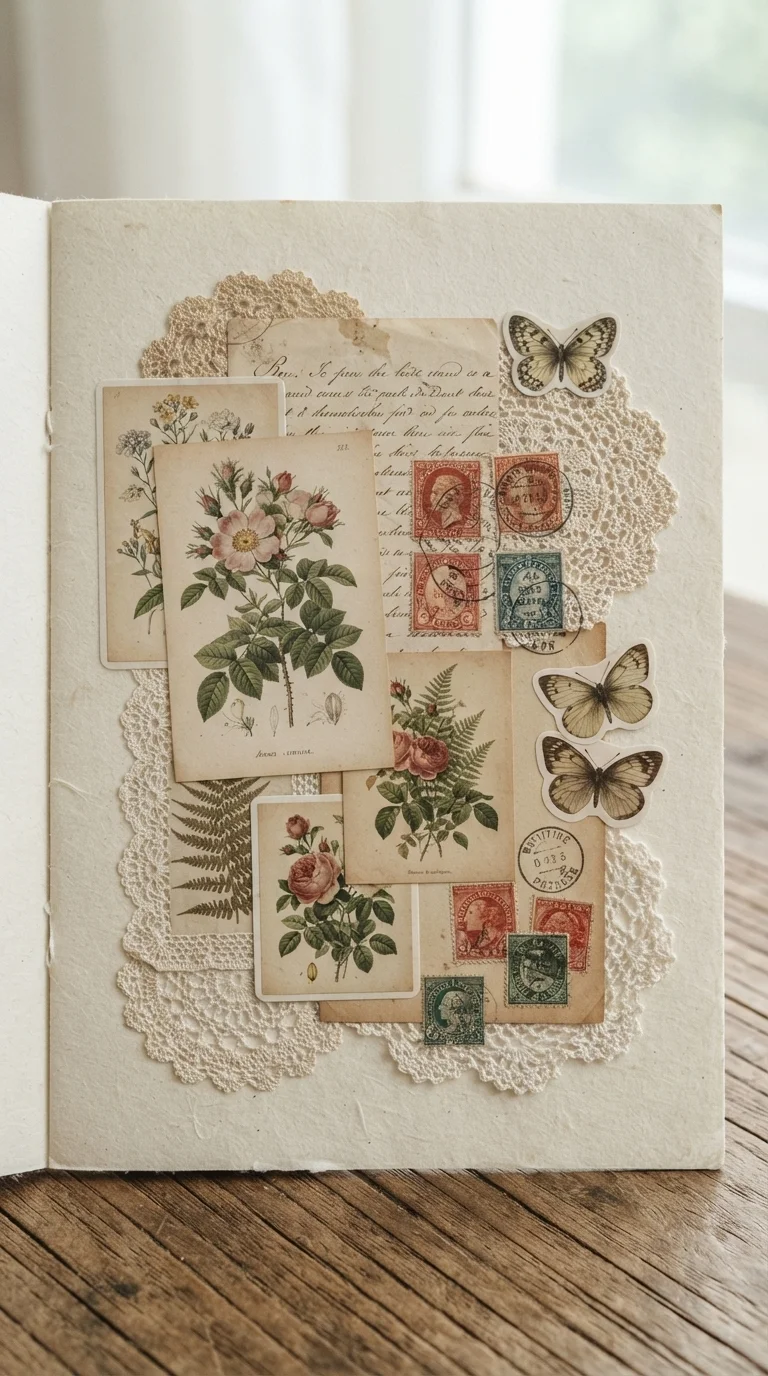
I absolutely love the romantic and intricate feel of Victorian ephemera stickers. When I use these, I often layer them to create a rich, textured collage on a journal page or a handmade card. I look for designs that include delicate botanical prints, faded handwritten script, and tiny antique stamps. The key is to let some elements peek out from behind others, giving the impression of an old, treasured collection.
I prefer using a matte finish for these stickers, as it truly enhances their aged appearance. For a budget-friendly option, you can print your own ephemera images on sticker paper at home; just make sure to use a good quality paper for clarity. A common mistake I avoid is overcrowding – sometimes less is more to let the individual beauty of each piece shine. This style works wonderfully for a sophisticated, nostalgic touch.
Retro Travel Postcard Stickers
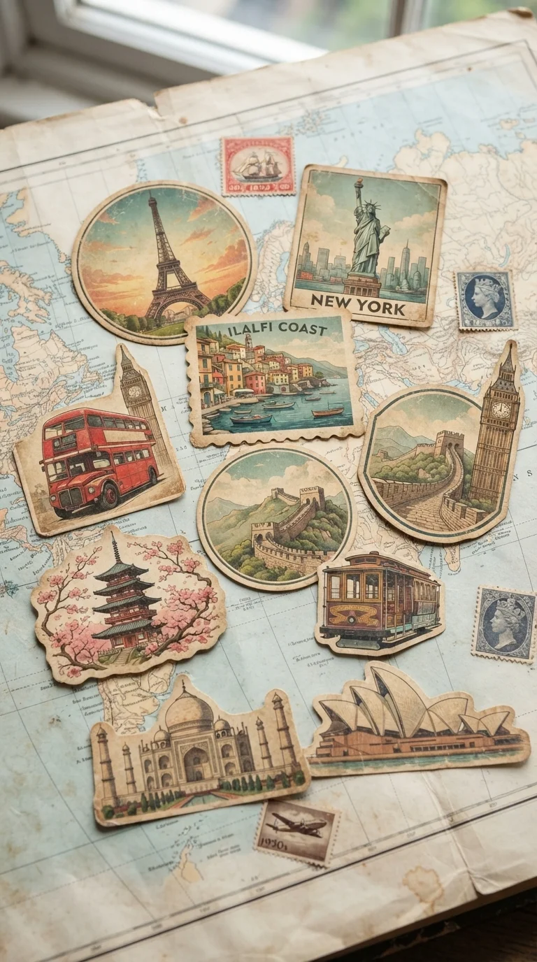
These retro travel postcard stickers always transport me to another era! I often use them to decorate the cover of a travel journal or to create unique scrapbook layouts of past adventures. I look for vibrant yet slightly muted colors, reminiscent of old travel posters, and designs that capture the essence of different destinations. Think classic cars, iconic landmarks, and vintage airplanes.
To recreate this look, I’d suggest arranging them as if they’re real postcards you’ve collected, perhaps with a faux ‘postmark’ sticker on top. For a realistic touch, I sometimes slightly curl the edges of a few stickers before adhering them, giving them a well-traveled appearance. I always make sure the background paper has a subtle texture, like linen or a light map print, to complete the illusion. They add such a charming, adventurous vibe to any project.
Grungy Grunge Scrapbook Stickers
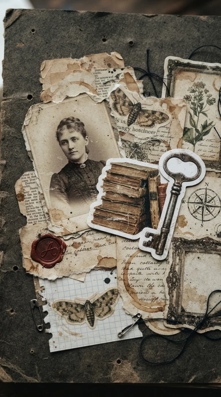
For those times I want a more raw and edgy vintage feel, I reach for grungy grunge scrapbook stickers. I love how these designs incorporate distressed textures, torn paper edges, and often a darker, more muted color palette with sepia and charcoal tones. I typically use these in my art journals or when creating mixed-media pieces where I want a bit of an ‘unpolished’ look.
I like to combine them with actual torn paper or fabric scraps to enhance the textured effect. You can even find stickers that mimic old, faded photographs or newspaper clippings, which add a fantastic layer of history. A practical tip: don’t be afraid to slightly distress the stickers yourself with a bit of sandpaper or ink around the edges before applying them. This helps them blend seamlessly into a raw, authentic composition, avoiding a too-perfect look.
Boho Botanical Pressings Stickers
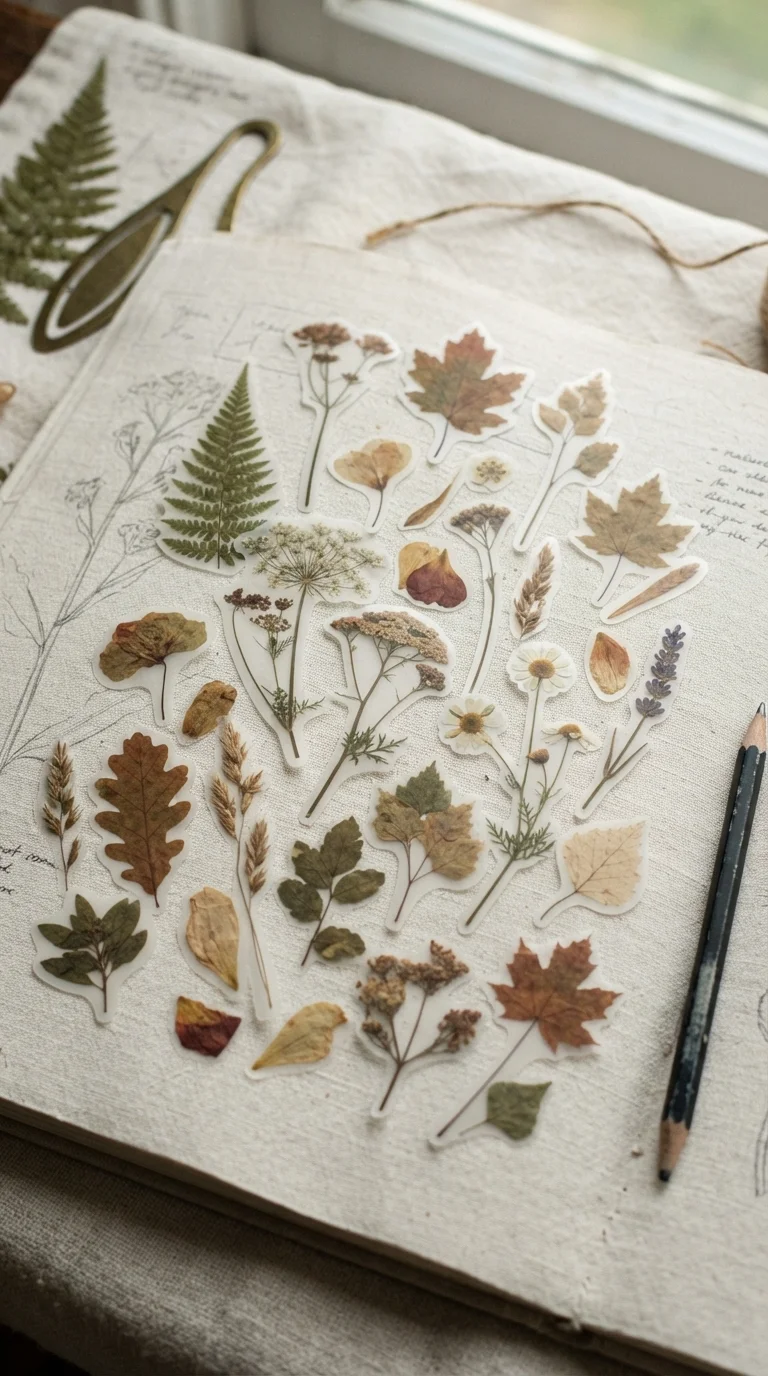
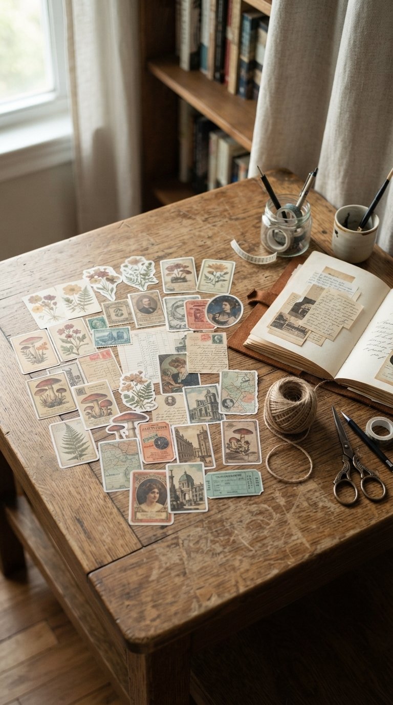
Boho botanical pressings stickers are perfect for bringing the serene beauty of nature indoors. I adore using these to decorate plant pots, create greeting cards, or even adorn simple gift tags. The designs often feature delicate illustrations of dried flowers, leaves, and ferns, usually in a soft, earthy color palette of muted greens, browns, and creams. They have a wonderfully organic and natural feel.
When I’m styling with these, I prefer to arrange them in a slightly scattered, natural way, as if the plants have just been pressed onto the surface. For a more authentic look, I sometimes use transparent or translucent stickers that mimic real pressed flowers. A simple tip is to layer a few different types of botanicals to create a mini garden scene. They really shine on natural materials like kraft paper or unbleached cotton for a truly cohesive boho aesthetic.
Steampunk Gears and Clockwork Stickers
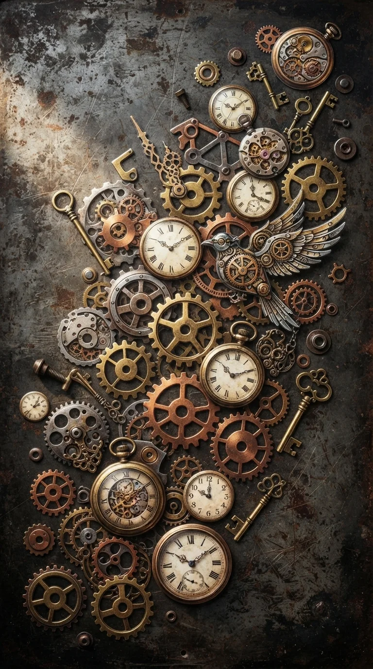
For a truly unique vintage vibe, I often turn to steampunk gears and clockwork stickers. These are fantastic for adding an industrial-meets-Victorian flair to projects like altered art boxes, journal covers, or even custom phone cases. I look for designs that feature intricate metallic cogs, old watch faces, brass keys, and perhaps some whimsical mechanical creature elements.
I find that layering different sized gears creates a wonderful sense of depth and complexity. I prefer stickers with a slightly metallic sheen or a distressed copper/brass look to really sell the steampunk aesthetic. A practical tip is to use a dark, textured background, like faux leather or a deep wood grain, to make the metallic elements pop. Avoid making the arrangement too symmetrical; a bit of organized chaos is part of the charm of steampunk, making it feel like a functioning, albeit fantastical, machine.
Art Deco Glamour Scene Stickers
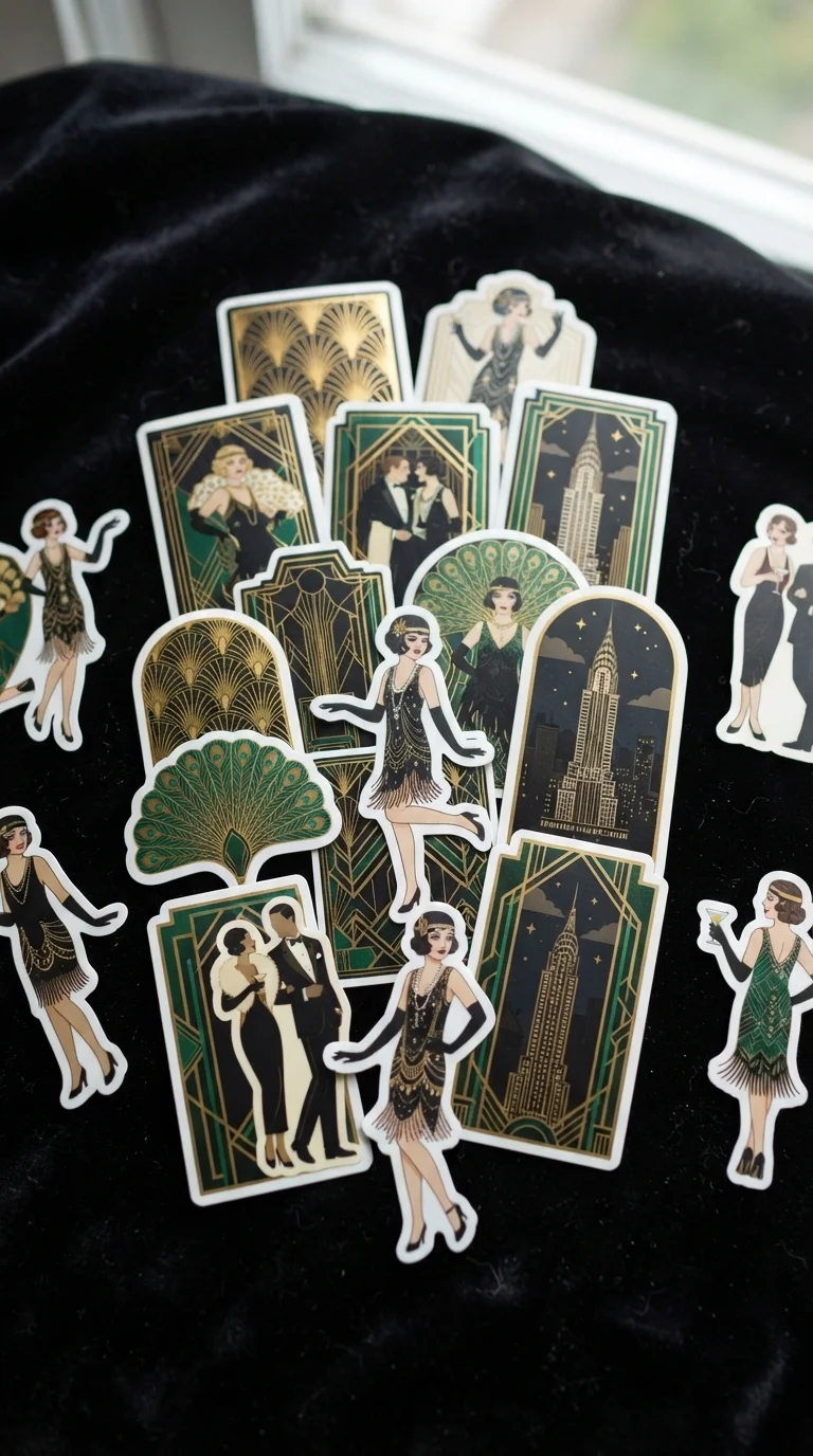
Art Deco glamour scene stickers bring an undeniable touch of 1920s elegance to any project. I love using these for creating sophisticated greeting cards, decorating a vintage-inspired mirror frame, or adding a touch of Gatsby-era chic to a plain notebook. I always gravitate towards designs with bold geometric patterns, stylized flapper figures, and luxurious motifs like ornate fans or skyscraper silhouettes.
When I’m arranging them, I focus on creating a sense of symmetry and balance, which is key to the Art Deco style. I prefer a color palette of rich golds, deep emeralds, sapphire blues, and contrasting blacks and creams to really capture that opulent feel. A useful tip: pair these stickers with metallic gold or silver pens for any handwritten elements to truly enhance the luxurious atmosphere. They instantly elevate a simple craft into something truly glamorous.
Vintage Parisian Chic Stickers
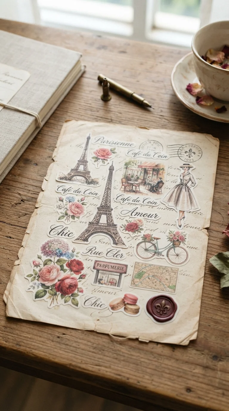
There’s something so effortlessly romantic about vintage Parisian chic stickers. I often use these when I want to infuse a project with a sense of elegance and old-world charm, like decorating a memory box or personalizing a photo album. My favorite designs include delicate illustrations of the Eiffel Tower, handwritten French script, charming café scenes, and classic fashion sketches from the early 20th century.
I love to arrange them as if they’re snippets from an old love letter or a forgotten travel diary. I often pair them with a soft, muted color palette – think creams, pale blues, and dusty rose – to maintain that romantic feel. A great tip is to layer them on a background that mimics aged paper or a vintage map of Paris. For a truly cohesive look, I might add a tiny faux ‘wax seal’ sticker to complete the illusion of a treasured keepsake. They make everything feel a little more sophisticated and dreamy.
Cottagecore Woodland Creatures Stickers
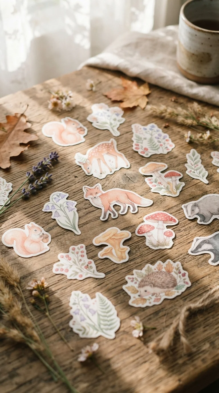
Cottagecore woodland creatures stickers bring such a delightful, whimsical touch to my crafts. I find them perfect for decorating children’s room accessories, creating charming gift tags, or adding a touch of rustic magic to a journal. I always look for designs featuring adorable squirrels, graceful deer, curious foxes, and sweet little mushrooms or wildflowers, all in a soft, pastel, and earthy color palette.
When I arrange these, I aim for a natural, slightly scattered look, as if the creatures are peeking out from a magical forest. I often use a background of kraft paper or a light wood grain to enhance the rustic feel. A practical tip: combine these animal stickers with botanical elements like tiny leaf or flower stickers to build a complete woodland scene. Avoid making them too formal; the charm is in their unpretentious, natural arrangement. They evoke such a cozy and enchanting feeling.
Mid-Century Modern Shapes Stickers
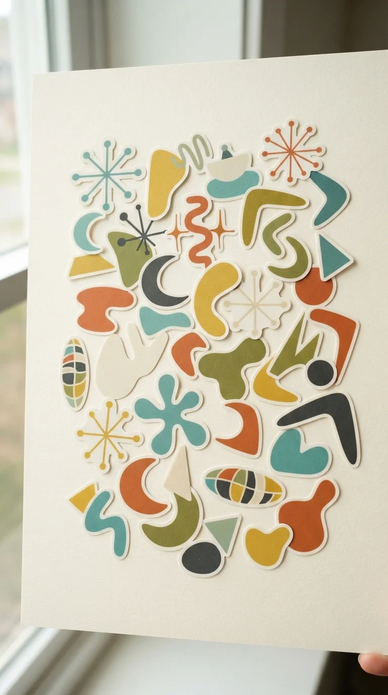
For a different kind of vintage, I absolutely love Mid-Century Modern shapes stickers. They bring such a cool, retro-futuristic vibe to any project, perfect for personalizing notebooks, creating unique wall art, or even jazzing up a plain piece of furniture. I gravitate towards designs with abstract geometric forms, atomic starbursts, and organic, amoeba-like shapes, all in that iconic muted yet vibrant color palette of teal, mustard yellow, olive green, and burnt orange.
When I’m arranging these, I focus on creating playful compositions that feel balanced but not overly symmetrical. I find that using a clean, light background helps these bold shapes truly pop. A useful tip is to vary the sizes and orientations of the stickers to add visual interest. Don’t be afraid to overlap them slightly or let some elements extend beyond the edge of your surface for a dynamic, modern look. They’re fantastic for a clean, stylish retro aesthetic.
Old Library Card Catalog Stickers
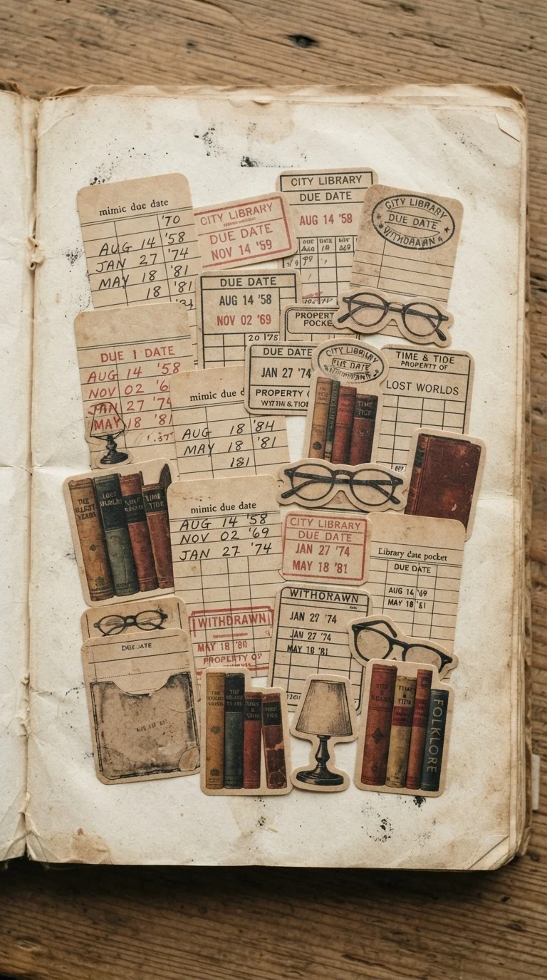
These old library card catalog stickers hold a special place in my heart as a book lover. I use them constantly in my reading journals, to decorate bookmarks, or even to create unique labels for my own book collection. I look for designs that perfectly mimic due date cards, old library stamps, faded book covers, and perhaps even vintage spectacles or quill pens. The sepia tones and slight ‘wear and tear’ details are key to their charm.
I love arranging them as if they’re actual elements from an antique library. For instance, I might place a ‘due date’ sticker next to a small ‘book cover’ sticker. A practical tip is to use a background that resembles aged paper or a subtly textured linen to enhance the authenticity. Avoid overly bright colors; the beauty of this aesthetic lies in its muted, scholarly palette. They bring such a wonderfully intellectual and nostalgic feel to any book-related craft.
Celestial Astrology Map Stickers
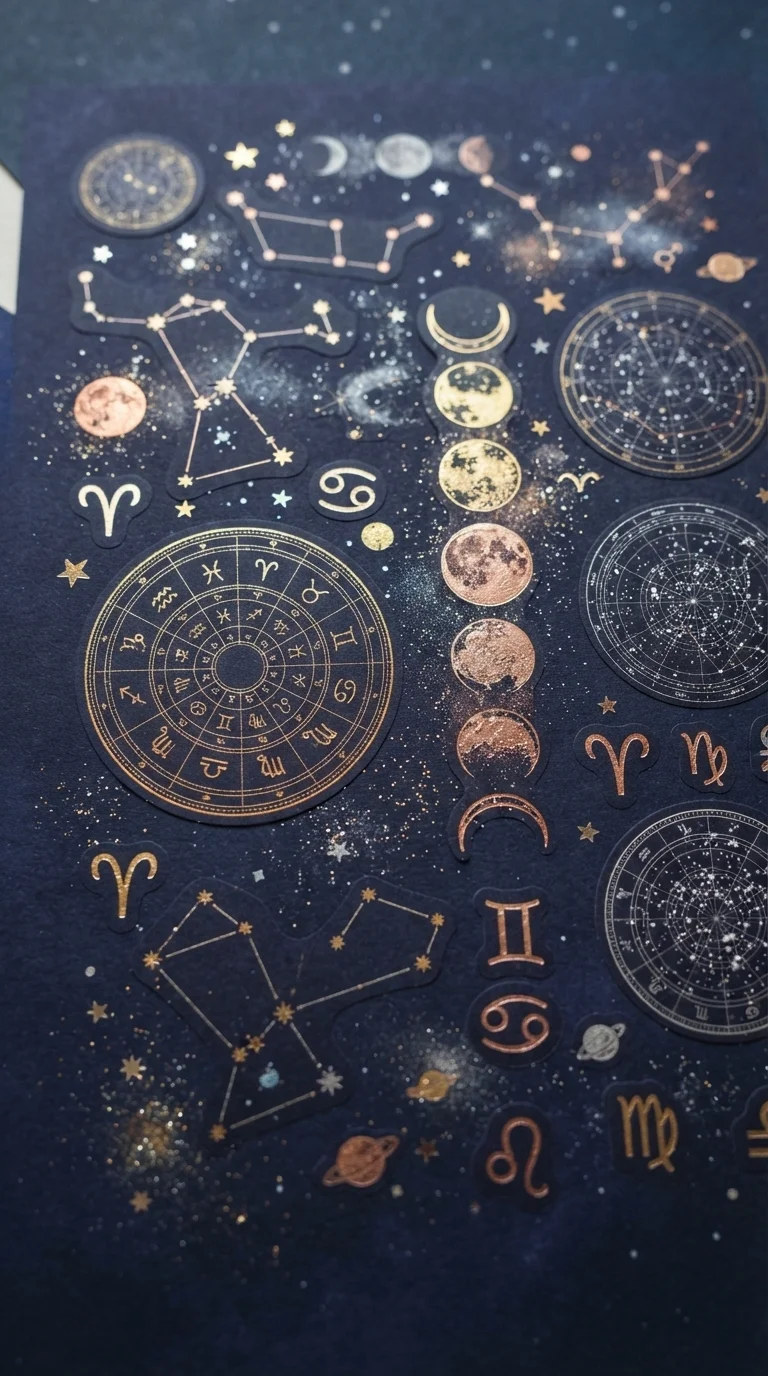
Celestial astrology map stickers are perfect for adding a touch of cosmic wonder and mystery to my projects. I often use them to decorate planner covers, create dream journals, or even personalize gifts for friends who love all things mystical. I search for designs that feature intricate constellations, beautiful moon phases, antique-looking star charts, and elegant zodiac symbols. The deep blues, purples, and gold accents are what truly capture this aesthetic.
When I’m arranging them, I try to create a sense of a sprawling night sky, with larger elements anchoring the composition and smaller stars scattered around. I prefer stickers with a subtle shimmer or metallic foil details to mimic the sparkle of stars. A great tip is to use a dark background, like deep indigo or black, to make the celestial elements truly glow. This style works beautifully for a magical, introspective, and slightly mysterious vibe, making any craft feel more enchanting.
Japanese Ukiyo-e Woodblock Print Stickers
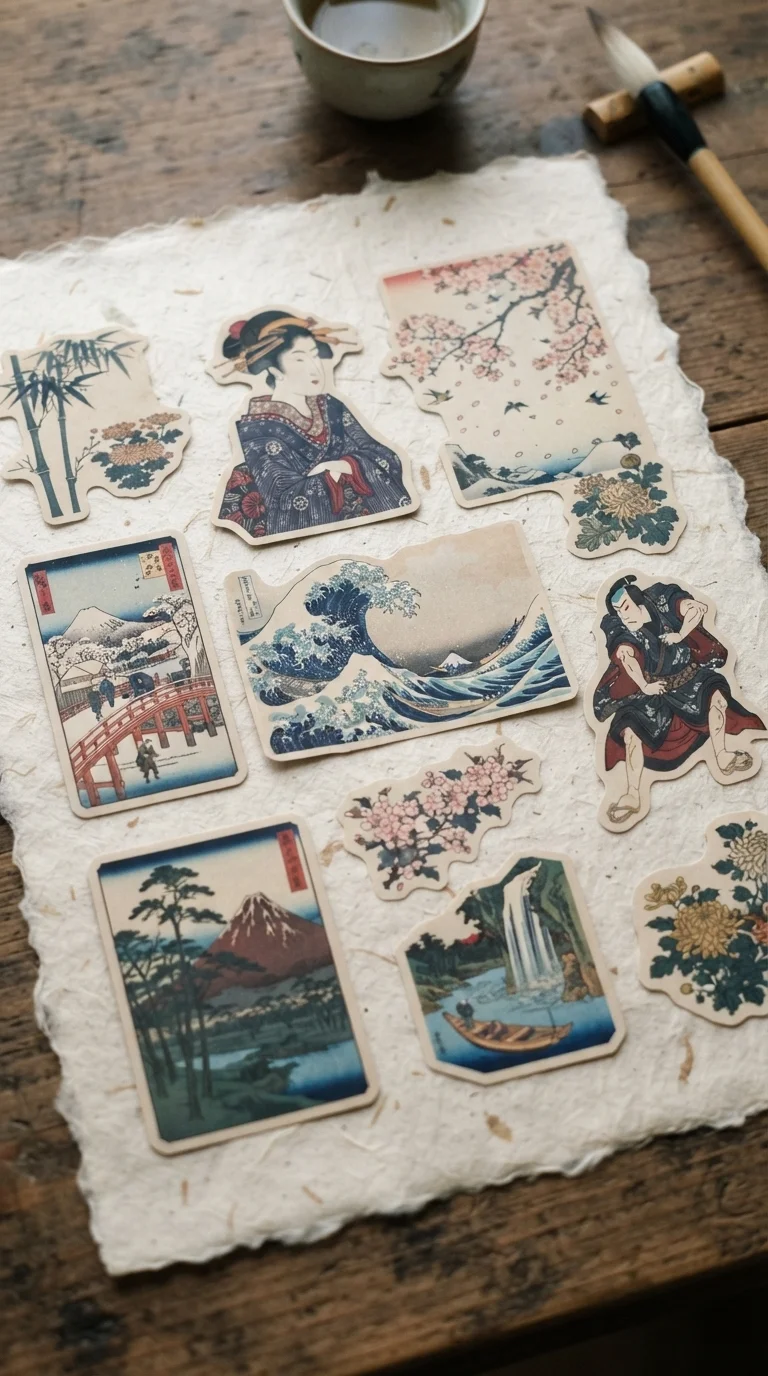
I find Japanese Ukiyo-e woodblock print stickers incredibly beautiful and serene. They bring such a unique artistic flair to my craft projects, whether I’m decorating a minimalist journal, creating a piece of wall art, or personalizing a plain box. I look for designs that capture the essence of classic Ukiyo-e art, like ‘The Great Wave off Kanagawa,’ elegant figures in kimonos, or serene landscapes with cherry blossoms and traditional architecture. The distinct graphic lines and traditional color palettes are what make them so special.
When I arrange these, I aim for a balanced, contemplative composition, often leaving some negative space to let the art breathe. I prefer stickers with a matte finish that mimics the texture of a true woodblock print. A practical tip is to pair them with natural, earthy backgrounds like rice paper or light wood. It’s important to respect the cultural origins of these designs by arranging them thoughtfully and avoiding overly busy or clashing elements. They create a wonderfully sophisticated and artistic statement.